


My initial ideas for the SOW logo were a pair of legs within a circle the legs representing 'sex' and the circle representing wax in terms of a acetate record.
I then started to think about what else i could link in to the logo. I came up with the idea of neon lights, these represent the peep show style visual that are seen around the red light and s districts and strip clubs around the world.
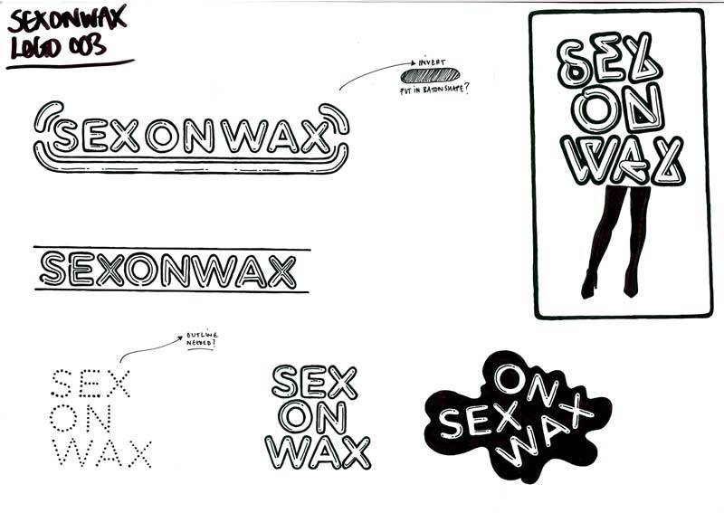
Using the typeface gotham rounded bold i started to add stroke and line's to create a neon light style typeface. this also resulted in quite a plastic looking type similar to PVC which also push's the 'sex' part of the logo.
I think i could work more on making the logo look more like a neon light and i might try different typefaces.
I shall now take these rough's and start to develop them within illustrator.
I want to get this brief finished within a week (or less than) in terms of design.
No comments:
Post a Comment