Showing posts with label OUGD 301. Show all posts

Wednesday, 15 December 2010

OUGD 301 Evaluation

Within this module I feel I have developed and progressed my skills in type and layout. I feel this is becoming more of a focus in my work and is something I want to peruse further within my FMP. I do feel there was a lack of use within using different materials and process’s as I spent too much time focusing on the actual designing of logo’s or layouts. To improve on this I needed to be stricter with deadlines and ensure I produce action plans and stick to them.

I also think a strength within this module was the presentation of work, I now feel competent I can produce work of a high standard and record it for use within my portfolio which is something I did not feel comfortable with in previous modules.

I felt I needed to do more in terms of working across digital, print and motion and next time I will write specific briefs to work within these areas and use the other as outlets for ranges and distributions.

I felt my lack of planning hindered the production of my work and tended to make briefs become boring as I was spending to much time on them re-adjusting things time after time. To ensure this won’t happen

I think next time I will work with more process’s when producing products and ideas and try and spend less time on the computer, this sometimes hindered me as I would spend to much time adjusting small things. I also think that not physical producing work at times made me feel less attached to my work and in turn I didn’t feel inspired at times.

Next time I will work to a faster pace completing briefs much quicker and at the same time planning them out much more thoroughly. I think this will help me complete briefs to a higher standard, as they will become more exciting and less laborious to as I like to work at a quick pace as I become bored quickly.

I also want to improve and specialize more within motion graphics, I have touched it slightly through the module but feel I am confident working within this process and want to make it a large part of my practice.

I also feel that I needed to use and produce more ongoing documentation in terms of evaluating and also in terms of annotating research to fully understand what I am looking at and why I feel It is appropriate to what I am doing.

Over all I feel I worked hard in the beginning of the module but due to lack of planning the work I was producing became stagnant and boring and this I why my latter briefs suffered in my opinion.

Tuesday, 14 December 2010

Tuesday, 7 December 2010

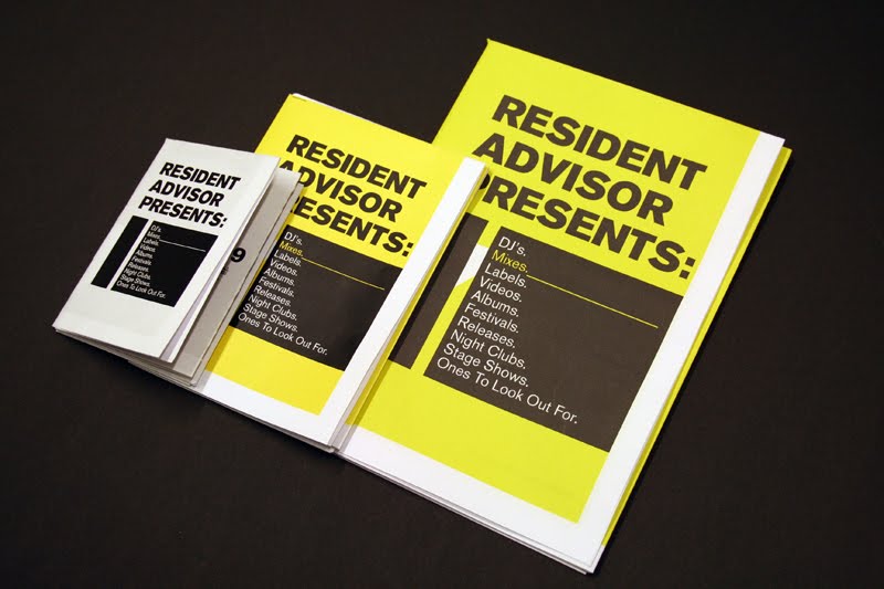
RA 10 mock up hotdog fold booklets.


These are the mock ups for the booklet started off with a a4 fold down then on to a3 then on to the actual document size. Just wanted to see which size worked best and see if it worked in terms of a format, which it does.

I shall now print and make a final product and digitally propose the other 10 booklets.

I also thought about doing short 5 second stings which can be used for promotion within resident advisor night and also as a ambiguous promotion tool on RA's website.

Monday, 6 December 2010

Final RA 10 bookelts layout.


These are the layouts for the final 10 RA 10 booklets. There are all quite uniform so that they work within a format and as a set. I chose not to use a array of colours as i felt the yellow and black works so well with the subject matter and the original brand.

The layout out is contemporary and different to the usual grind system layout to put emphasis on the lifestyle of the the target audience.

The booklets consists of :

The 10 Best mixes
The 10 Best festivals
The 10 Best DJ's
The 10 Best Labels
The 10 Best Releases
The 10 Best Albums
The 10 Best Nightclubs
The 10 Best Stage Shows
The 10 Best Videos
The 10 Best Ones to watch.


On the rear of the booklet there is a contemporary poster that would look good in any modern clubbers home.


RA mini site


Based upon the design of the booklet's/posters I have design a Mini site that will be the distribution for the the limited edition pack. This will allow the buyer to see what this product is about and where it is available from along with some preview information about whats inside the booklets.

RA 10 Update and work.


This will be the new logo for the RA 10 brief i am doing. Simple and chunky with a techy feel to it.

I went back to the original idea for ten by resident advisor, re-worked the idea a bit and came up with RESIDENT ADVISOR PRESENTS 10, using the 10 as a mini brand i will design and produce 10 booklet's that double up as 10 limited edition poster that are available to buy on a 10 mini site.

Each Booklet will be a top 10 of 2010 voted by the kind people at resident advisor. The booklets are a set and will come in a uniformed design consisting of the Akzidenz type face ( similar to helvetica which RA use for most stuff but still different enough to be noticeable) yellow black and white the colours that resident advisor is known for and also to the tastes of the target audience.

Each booklet will come in the format of a hotdog fold the original substrate size will be 639mmx447mm and be printed on to a thin bright white stock enabling the product to be folded down into a booklet.

Tuesday, 30 November 2010

R&S records.


My intentions for the r and s records was to bring it up to date from the existing logo. I took the form of a r and s and simplified them to two shapes which can used across a massive range.

This also represent's the simplistic straight to the point music that r and s in known for.

Hoya:Hoya


Quite happy with the final out come of the hoya hoya branding it's playful and chunky much like the music that hoya hoya are known.

The colours represent the light's of a night club and could be used for proposed ranges of music release's or club nights.

I want to try and get that electronic japanese feel to the branding as the name hoya hoya also suggest's this.

Final 5 Logo's


The HOYA:HOYA logo was based on the theme of old skool computer games with a comtempory twist. Creating a chunky typeface to also represent the music.


Klap Klap logo based upon the existing logo, but simplified to a pictogram style logo that can used at a number of size's and across a number of ranges.


NSA dubs logo based upon the sound of the label. Broken and futuristic.


The R and S records logo was produced to update the label using two simple shapes that represent the letter forms R & S along with a new type face that can be used across r and s branded material.


Sex on wax logo was produced with the idea of sleazy style sex culture the type face was chosen as it gives of a rounded look similar to that of neon light's that are well know for being the the window's of certain 'shops'.


Hoya : Hoya Letter heads and compliment slips.


Hoya Hoya flyers Applied Logo and typeface.


Front.


Back.


Using the colour palette i applied the logo across a promotional flyer. The Hoya Hoya type face was hard to read as body copy so i used helvetica for the body copy staying in tune with design direction there already have.

The use of helvetica suits the subject matter as well as complimenting the less ledigble Hoya Hoya typeface.

Hoya Hoya Idents

Untitled from martyn woolley on Vimeo.


Untitled from martyn woolley on Vimeo.


Untitled from martyn woolley on Vimeo.


Untitled from martyn woolley on Vimeo.


Hoya Hoya I-dent 5 from martyn woolley on Vimeo.


Just did some quick i-dents too show how the logo could be used. These could be used to promote there youtube page where they upload video on a regular occurrence or even at there club events in manchester as a back drop for the night club.

Within these idents/sting the colour pallete is very affective its throws off hints of night clubs light's as well as that computer game style which fits the music style and fan base.

Hoya : Hoya


The idea was to use's a large colour palette which can broken down and used as theme's within other branded material.

Quite like the diagonal colour way, could be used within a motion graphic quite well as the baton behind the logo are prime for movement due to there 45 degree angle.


Hoya:Hoya


Started out quite direct with this logo, I wanted to base it around the actual words within the logo "hoya-hoya" which i think gives off a slightly oriental feel. I then thought about the music style and genre which would suit with the modern electronic Japanese style brands and artwork so i went along those lines when developing.

Whilst coming up with a custom logo I though about creating a full typeface which could be used within other promotional material and the within the brand itself.

This could be used on sampler cd's, flyers, poster,s the website and other online resources or even motion graphics for the event.