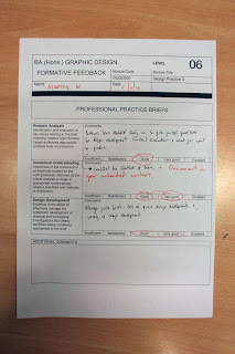
From the crit i gained feedback on the RA10 brief and the RSS brief. The feedback for the RA10 brief was that the direction was good and suited the target audience but the size of the send out/poster was too big to hold to read. This brings up a problem. Any smaller and the Poster just wouldn't work in terms of atheistic and two if the send out was any smaller the text would be too small to read and print. I think i shall stick with the original sized planned as i wanted it to be quite big as most literature of music events is smaller and tends to look standardised in format and layout. I need to look at the colour range again as some of the colour treatments were giving off vibes such as hospital's which is something i want to stay clear of.
I also got feedback on pushing the idea a little more how far can i take the idea of 10?
More feedback I was given was taking the concept to screen, ideas suggested were a interactive map of some kind that went on the RA website. I have also though about i-dents that could be played at RA events as a visual through projection.
The last feed back i gained was that the title needs re- thinking, TEN BY RESIDENT ADVISOR dons't seem to work and so I think I am going to go with RESIDENT ADVISOR PRESENTS TEN.
The feedback for the RSS artwork was good, it worked well is clear and to a point almost anonymous, letting the music do the talking. Again i asked how could i push the brief more, and was given suggestions of doing t-shirts, tickets, wrist bands etc and other music merchandise.
After this feed back was given i did t-shirt designs that matched the branding of the packaging and also created viral/promotional internet stings that would sit on the website and get posted around by the RSS Street team.
Something that came up as well was that i need to do on going evaluation, which i will address by blogging what i have done and evaluating the progress at least 3 times a week.


No comments:
Post a Comment