skip to main |
skip to sidebar
Development - lyrics
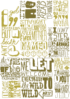
I felt my original type forms needed refining adding more detail to create more interesting visuals. Again this could be used for promotional items as well as in my motion graphic.
2 treatments for my top ten animation. One b+w and one in two tone gold, which i think looks quite good, it still manages to be as legible as the b+w as well as giving it a extra touch.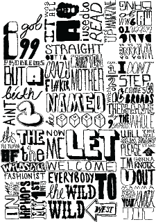


No comments:
Post a Comment