
Thursday, 28 January 2010
Test 4
This is my first 50 second test. It still needs touching up in composition and transitions but i am happy with it overall. I decided that breaking my 50 second clip into 10 x 5 second clips would make life easier and also enhance the animations as it meant a rhythm could be achieved and also kept it fresh and exciting, so not to bore the viewer. Im am going to try put different clips in different orders to see if one creates a better viewing experience than the previous ones.
Still need to get down some more story boards so i can get more ideas for movement down.
Wednesday, 27 January 2010
Test 2 and 3
A couple of initial test's really like how things are coming along, the pace and movement are interesting and will keep the viewer interested. One thing i may need to investigate is color, i want to try and incorporate some color but without losing the original concept of my brief, i feel this may be hard due to the look of 80's hip hop flyers.
Monday, 25 January 2010
Feed back tutorial
Strengths that you have developed during Level 5.
- Organization and planning skills
- Time management
- Understanding of design context
- Design for motion
- Better understanding of commercial print process.
- Attendance
Weaknesses that you have identified during Level 5.
- Attention to detail
- Critical studies task and reading
- Idea generation
- On going Documentation of work
- Evaluating on going and final.
Issues that you want to discuss with regards to your current progress.
??
Action plan-------
Critical studies essay
Managing deadlines
Studio research feeds into my dissertation research.
22.3.10
Portfolio and CV
So I can apply for work placements in a area which I wish to go further in.
15.2.10
Digital module
To increase my knowledge and skill in producing motion graphics.
10.2.10
Design context
Helps me continuously develop my understanding of design and design in context.
Ongoing
Image module
To increase my attention to detail and help me understand a area which is somewhere I want to specialize in.
19.4.10
Sunday, 24 January 2010
Wednesday, 20 January 2010
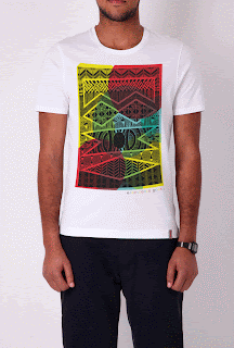
Electronic Poet & Radio Slave & ME
Electronic poet have asked if i could throw some colour on to the Radio Slave collaboration T-shirt there doing. I got asked at 7 and had a 7 colour way PDF off to them by 8.30. This is my particular favorite.

dvd menu title screen

Here is a idea for my menu screen, im quite happy with the composition although the MTV top ten MC's of all time needs to be pushed up a little and the through the DVD studio pro workshop i have learn't that my buttons need to be a more simple shape or uses a marker symbol to select the selceted menu button.
DVD pro.


First tutorial workshop in dvd studio pro, Quite easy to get your head around and i can see how sequentially saving your work will help and also should be quite easy to work out once my final schematic is done.
I did come across one problem, due to my button's being a irregular shape so i will have to change them, but apart from that im quite confident i will be able to get it done.
Friday, 15 January 2010
Development - lyrics
I felt my original type forms needed refining adding more detail to create more interesting visuals. Again this could be used for promotional items as well as in my motion graphic.
2 treatments for my top ten animation. One b+w and one in two tone gold, which i think looks quite good, it still manages to be as legible as the b+w as well as giving it a extra touch.
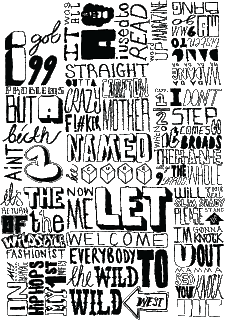
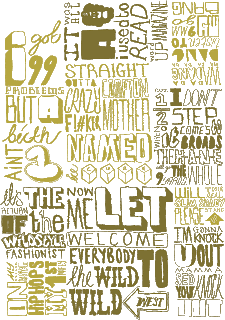
2 treatments for my top ten animation. One b+w and one in two tone gold, which i think looks quite good, it still manages to be as legible as the b+w as well as giving it a extra touch.


Thursday, 14 January 2010
Subject, Design direction and rationale
BRIEF TITLE
Top ten------MTV’s top ten MC’s of all time.
SUBJECT & RATIONALE (including themes, target audience, tone of voice)
Taking It Back.-------- The theme for this motion graphic will be old skool hip hop. Taking heavy influence from early days hip hop flyers and early graffiti style typography which has seen a current rise in popularity.
My target audience is MTV’s viewer’s, which have a median age of 21.6 years. I feel that the visual language used is appropriate for the target audience and gives off a young, fun, informal look.
DESIGN DIRECTIONS ( DESIGN CONCEPTS, TONE OF VOICE, ETC.)
The tone of voice will be informal, and fun which will connect with the viewers, I shall be using black and white for the text which references my research into early hip hop visuals and other similar typographic treatments and at the same time will make the type more legible. I will use another bright, bright exciting colour but need to test to confirm what this will be. At the moment im thinking of a Bright gold(although this contradicts my design rationale as I want to take hip-hop back to it roots rather than the bling style it seems to hold now.), Bright slime green and Vibrant fuchsia, these are the types of colours used in 80’s style visual’s high contrasting ,vulgar colours.
Action plan.
Finish all assets and illustrations by the week starting on the 18th.
- Rappers names
- lyrics
- relevant imagery
*18th - 24th Decide and finish schematic for dvd menus and titles.
*18th - 24th Start story boarding and testing animation pieces.
Wednesday, 13 January 2010
Monday, 11 January 2010
Thursday, 7 January 2010
Initial ideas Top 10

Some hand drawn type treatments to help the development of the top 10 brief.
This could be used as compositional pieces for my motion graphic , visual's for my cd packaging or promotional material such as 'rapping paper' or LTD screen printed poster's.
Subscribe to:
Comments (Atom)