Monday, 24 May 2010

Desktop ideas.


Looked into doing some desktop images which will be available for free download at www.mitternacht.de. I will have to consider a range here due to forever changing sizes of display units.


Sizes to think about?

640x480
800x600
1024x768
1280x1024
1600x1200
1856x1392
1920x1440
2048x1536


Think the gray scale ones work better as they tend not to grab you eye as much and the image should defiantly be on the left hand side of the screen as most desktop icons ( on mac ) are on the right as default.

Back Breaking Mailers.


click for a bigger version.


Screen printed the mailers with the original logo as i felt this was best option for identity. I think if i had of gone with the half tone photo it may of caused confusion and not be as direct. I also think the type based cd/vinyl sleeve will work better as more can be made at once which creates a cheaper product which is what we want. I also felt that the hand screened prints gave the impression of a diy approach which is what mitternacht is all about and is what i wanted to get across with this/these products. A digital print i felt would of made the products come across as more of a mass produced peice intened for a large amount of customers compared to this approach which gives of a more organic, personl feel due to the imperfections in the print.

Thursday, 20 May 2010

A1 not A0 ;)

Size: Final poster


Ideas for final poster. I have changed the size just because a1 is massive and it would be impossible to drop in and print it down stairs so i've opted for a poster that is half the size of the original and folds in to two rather than 4. And it will keep costs down yet again.

Final 4 Mitternacht web videos for next months event.


I decided to give Leon two video treatments one text only using type as image and also information and one that's based upon the designs for the resident mix cd packaging.

The text one ones work well in terms of informing and also in terms of engaging with the audience as it is just as easy to understand as written static text. The image heavy based video also delivers in these areas but the imagery just add another element that will engage with the viewers.

I used the yellow text to visually tie in with the colour of this months event which is yellow. This would make sense to make the first resident mix to be the yellow mix.

Inner sleeve final designs

So i have decided that to cut the cost down it would be more effective to print all the sleeves the same there for not needing new screens every month a new resident mix comes out. Instead of changing the actual sleeve i have decided to use a coloured sticker which represents each mix. Eg blue mix, red mix, yellow mix etc. I think this not only works better in time of production and cost but also give quite a simplistic minimal form to the work which again ties in with mitternachts values.

I came up with the idea of printing the vinyl sleeve with all 6 numbers on it. Then sticking each sticker over or under the number. Again this gives that hand crafted D.I.Y feel i want to aim for. So just need to decided on a final one (i think it will be the last one the layout if different and engaes you on the numbers which is the most importnat thing.) and screen print them up.


Wednesday, 19 May 2010

Monday, 17 May 2010

Mitternacht test video 10

Mitternacht test video 9

A0


Poster layed out on a A0 page. This give me enough space to fit more printed material on each page resulting in cheap production cost's.

Square poster also pushes the whole vinyl aspect of the brief and Mitternacht brand.

Promotional poster treatments


Treatments for promo Mitternacht poster. I've decided on the size of 610mm x 610mm which will have to be printed on A0 which will give me space to fit other products on.

The poster can be folded down in to 4 and will fit in the Mitternacht mailer along with the Mitternacht promo mix CD sleeve creating a promotional mail shot for the loyal Mitternacht clubbers and also for PR with other promoters, artists and similar like minds in the record label.

Confirmed sizes and product range

Promotional mix CD packaging

Screen printed branded mailer - 345mm x 345mm

12' CD outer packaging sleeve - 310mm x 310mm

CD inside sleeve - 305mm x 305mm

Actual CD 120mm x 120mm

Website and Promotional Web Videos

Sign up and promo website - 1200 x 900 px

Promo web videos - 16:9 wide screen hosted on Vimeo

Promotional poster

Screen printed promo poster - 610mm x 610mm

Sunday, 16 May 2010

Design direction 2 Mail Packs

Design direction 1 Sleeve


Design direction 1 Mail Packs


Blank record sleeves


Managed to get hold of the blank record sleeves i got mostly got white ones which i intend to use but also got a selection of 5 colour ones aswell. Might see how these work with prints on. see what works better.

The brown envelop is a record mailor i thought this would be a good idea as most of these packages will be sent out so they need a vessel ( which can be branded as well ) to travel in.

Friday, 14 May 2010

Mitternacht web video test8


Using the position and transform tool i tried created the impression of video footage. I think this worked well and is something i will take forward.

Mitternacht web video test6

Thursday, 13 May 2010

Treatments for web video design direction 1


Using the cropped/macro photos i took for the image based design direction i decided to start using them in my web videos. I just have to remember that when using photo's i have to use a situation where the objects in the photo are static in real time, this way i can recreate a camera movement that gives the appearance of video footage.

Quick mock ups. Design direction 1.


Decided to look at possibility to present to the client resulting in 3 design direction consisting of a heavy image based direction with minimal type, a type only direction and a more balanced type and image direction.

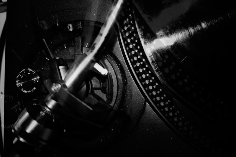
This is a quick mock up of the sleeves for design direction 1 using image as the main visual. I have used cropped images of Technics SL 1210 which are industry standard record players and other Club/DJ related products.

Using halftone, the images have resulted in a industrial feeling style which again backs up the techno party aspect of Mitternacht.

As well as using the screen printed images i have applied stickers to the mailer which indicate the edition by colour and produces a identifiable product range.

Wednesday, 12 May 2010

Crit feed back


General feedback good. thing to consider are, how far can i push this range what other thing can i produce too create brand awareness and keep existing customers.

-CD packaging range
-Website to host them with info.
-Promo web videos

-Point of sale stand (could the records be a free give away in records shops, think don't panic!)
-Tickets for events
-Wrist band for events
-T-shirts
-In club banners
-Stickers
-Party pack.
-Hand screened poster for PR within the scene.

Could this CD packaging contains a number of things?


Action Plan.

Finalize CD packaging design week ending 14th.

Print up and test

Photo

Website start

finish motion graphics.

Tuesday, 11 May 2010

Animated giff front page idea

Photobucket

Wanted something similar to the TDR home page think i need to play around more to create a better flashing front page though.

Veri inital rough layout ideas for website.


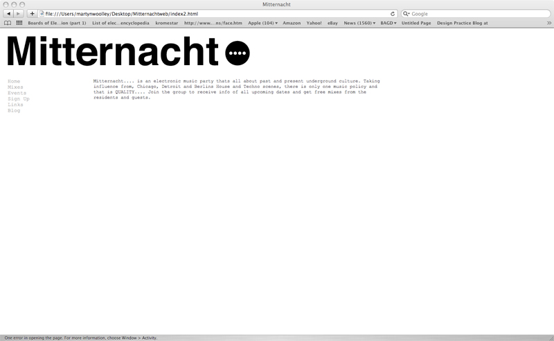
Few amendments the website will be 900 px wide. After speaking to a few web designers they old me that the standard size is usually this so it dosnt matter what monitor size you have the website is viewable by all. After designing the home page i will base the other pages around it i think after feedback i got in the studio. The page will be two colum's wide on for the navigation and buttons and one for the infomation and photo's.

Monday, 10 May 2010

OUGD 203.2 update

After talking to Leon at Mitternacht over the weekend we have decided that 12 monthly CD's would be unrealistic at this stage. So we have opted for 6 which works better on time scale and also on production as well as with the night as Mitternacht is pretty much every other month rather than monthly. Im just waiting on some blank 12" packaging so i can play around with fitting a cd in there and getting them made up.

We also thought we needed some where to show and distribute the CD mixes with a track list and artist info etc. As Mitternacht doesn't have a web site we though this could be the best way to go. Just a real simple website showcasing the mix CD's in there packaging and also on the front page some sort of motion graphic showing information about that month's event.

Still working on the small short web based video's some are working better than others but they look like they will do the job asked.

I did some stickers on he vinyal cutter of the mitternacht logo which went down a treat on the last event... so i'll produce some more.

And finally i also want to do some MASSIVE screen printed poster's for leon to give to the many record shops he visit's as a promotional tool. Even if the record shop dosen't put it up its still a gesture worth giving and is good PR. As we have to justify the point of working in A size paper im trying to think of ways of getting round this by maybe making the poster sqaure (again like a record sleeve) or some sort of other shape.

Thing to propose:

T-shirts
tickets
club visuals
entry bands
stationary