
Sunday, 30 May 2010


Saturday, 29 May 2010

Thursday, 27 May 2010
Wednesday, 26 May 2010


Print test inner sleeve

Just wanted to see which orientation would work better on the record sleeve's. After discussing with alex we both felt that the lower print works better and is more interesting creating a image from type which is something i feel is a strength and something that i like to work with. The top image we felt had more of a functional form but didn't look as visually interesting.
Mitternacht-Wrist bands


 j
jI originally proposed these entry wrist bands but whilst waiting for screens to dry i mocked some up just to see how they work. Using a repeat pattern of the Mitternacht branding creates something that can be used for functionality purpose at events and also as i promotional product as people may keep the wrist bands for memorabilia.
Printed CD range


The CD range here shows which mix CD it is via the choice of colour. This will enable the viewer to recognize the what they are viewing etc.
I feel that the offset text is just a bit more interesting then having it centered and the branding and logo are already plastered over most of the packaging so i feel it creates a more balanced visual as well as keeping a visual tie.
The coloured bar is a simple, functional and no nonsense key system which links in with Mitternacht ethics.
Tuesday, 25 May 2010
CD range

This is the print for the CD mix range i just stuck to the colour's of the stickers which visually and informational ties everything together.
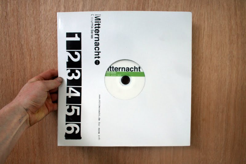
The visual will come through the hole in the vinyl sleeve showcasing which mix it is.
Colour mix series.

Got the colored stickers done for the cd packaging. They are ment to go on the inside sleeve rather than the mailer but just wanted to try them on the outside see what it looked like. The outcome works but i feel that using a sticker both on the out side and inside would be too much and too busy. And the inside sleeve realise on the sticker to inform the opener which which product it is.
Inner sleeve final designs and screen


I needed to see the rough size of the layout of the inner sleeve, just made it it easier to choose which one i wanted to use and also gave me chance to ask other which one works best.
Hopefully should get these printed up tomorrow along with the CD's which i think I'm gonna do in the same colour as the sticker and mix code just to make it in.
Monday, 24 May 2010
Test peices


Just some test's i did on other stock colours etc. The colours one really stand out actually maybe could of thought about getting six different coloured inner sleeve to play with could of backed up the colourmix series.
Just tried the white mitternacht sticker on the sleeve as well this could of been another option to take forward as a cheap promotional tool.
Web site screen shots


This is the finalized web site for the crit tomorrow. I think the out come has worked and met the brief.
1 Mitternacht had no web presence before.
2. Its simple and straight to the point which backs up Mitternacht ethics.
If i was to do this again i would like to try a tiled back ground of the Mitternacht circle logo with white box's for the text although i do feel this would not push forward or tie in with the Mitternacht brand and could be seen as too flashy or stylized.
Another thing i might change is the home page i like the the desktop page with the photo i think it gives a more balanced visual appearance due to the Mitternacht logo being splashed every where.
Subscribe to:
Comments (Atom)