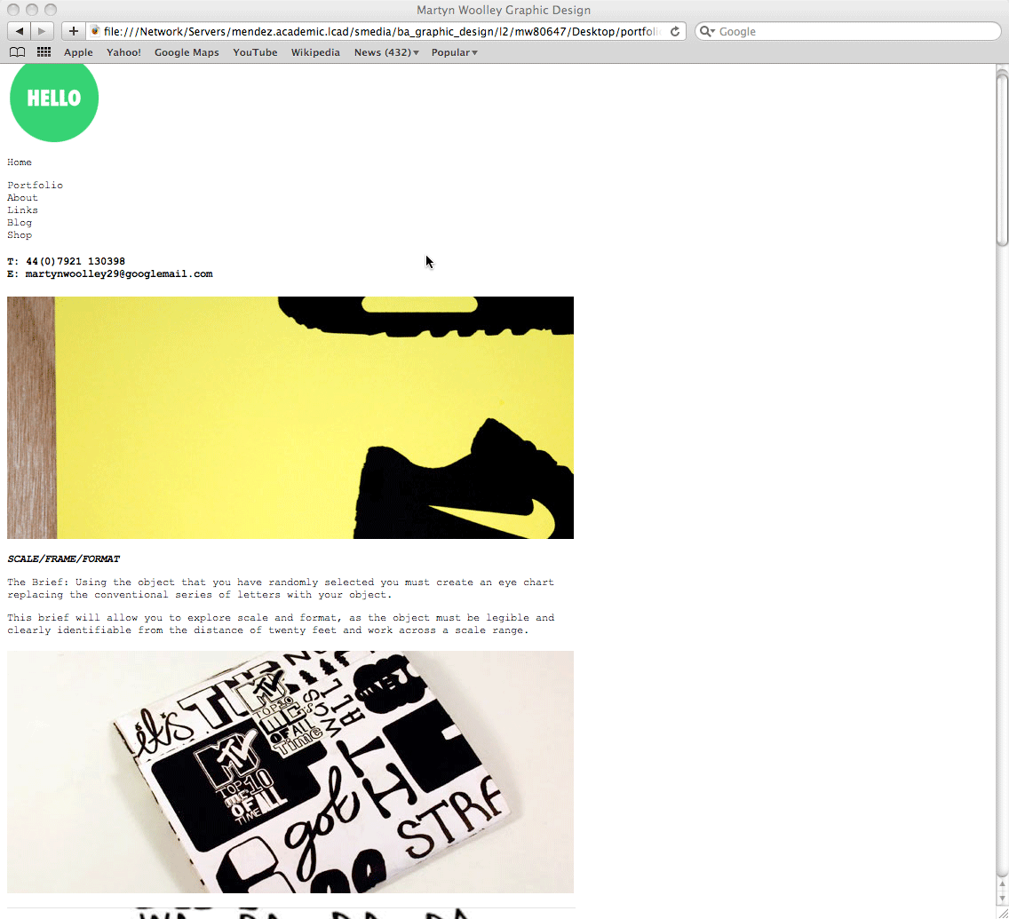
Loving the progression so far. The simple addition of your blog colour pallete (the green 'Hello' circle) is an excellent addition and achieves a 'brand' consistency I presume you were aiming towards.
The only thing that bugs me a bit is when you are showing different sections of your site i.e. pages which i presume are 'Home' 'Portfolio' and 'About'.
To me the navigation seems too close to the images/text. there doesn't seem to be a division and it lacks clarity as to what the page the viewer is on. Shouldn't think it would take too much to address this. Maybe green typewriter text saying what the section they were viewing? Or perhaps changing whats inside the circle? Instead of Hello is says 'Blog' or 'Shop'. Although Portfolio might be a bit too long? Perhaps replace with 'Work'.


Loving the progression so far. The simple addition of your blog colour pallete (the green 'Hello' circle) is an excellent addition and achieves a 'brand' consistency I presume you were aiming towards.
ReplyDeleteThe only thing that bugs me a bit is when you are showing different sections of your site i.e. pages which i presume are 'Home' 'Portfolio' and 'About'.
To me the navigation seems too close to the images/text. there doesn't seem to be a division and it lacks clarity as to what the page the viewer is on. Shouldn't think it would take too much to address this. Maybe green typewriter text saying what the section they were viewing? Or perhaps changing whats inside the circle? Instead of Hello is says 'Blog' or 'Shop'. Although Portfolio might be a bit too long? Perhaps replace with 'Work'.
Anyway, keep going. Looks good!