Brief- YCN Collaboration brief.
British music experience.
Problems
- No one know where they are
- The visuals are not representative to what there about.
- No motion graphic advertising on any contextual websites or TV channels.
We intend to:
- Inform where the BME is.
- Promote the fun and interactivity of the BME.
- Persuade a through exciting,fun and interactive visuals.
A group of: family's, encouraging contemporary family days out. Similar to things like the Baltic in Newcastle, or the Tate Modern and Design Museum in London.
We will produce:
Printed material - posters, flyers, packaging.
Digital media - Motion graphic Web sting.
Friday, 26 February 2010
Thursday, 11 February 2010
Evaluation
I feel through this project I have selected research, which is appropriate to my brief. This has informed my design decisions and development. I felt looking at indent’s for the specific channel (MTV) helped me see what the targeted audience would appeal to. If I was to do this project again I would like to look more into stop frame animation to create a hand rendered look, which would tie in with my concept using the hand rendered imagery and sequences. This could give off a more authentic feel. I also feel that maybe looking more at pace would of helped me as I tended to edit to music, breaking existing title sequences might of given me ideas about pace and transitions which will of enhanced the final product.
I felt my Investigation and experimentation could have been more present on my blog and documented more. I found experimenting with my hand rendered type gave me ideas for storyboards and sequences. I felt that my quick scruffy design ideas and storyboards were he most effective for idea generations, as I tend to lose interest in something when I take a large amount of time on it. If I was to do this again I would take more time creating more storyboards that were a bit more refined and clear, this would help me make more refined decisions about composition and movement.
Through this module I felt I have developed a number practical skills such as time management and preparation. I found this to be a massive help especially when dealing with numerous amounts of file and design sheet. I also felt I have improved my practical skills in software, I have improved my finishing skills in illustrator and also learn't how to use completely new software After effects which has led me into a new way or working.
Documenting my work through this module has been my weak point I feel, not showing everything I did as test, or experiments. If I were to do this again I would try and document everything possible on my blog. This way I can easily go through my ideas and design practice, which will give me ideas for the future.
I felt that my final product met the brief; I felt that keeping the transitions and sequences simple made for a more effective motion graphic, hopefully keeping the audience engaged. If I was to do this again I would like to try and create more complex movements and transitions which would be possible thanks to my development of practical skills.
Things I will do differently next time.
1.Keep my work systematically saved so it would be easier to deal with at the final point of design.
2.Experiment more and document it through my blog.
3.Experiment more with colour .
4.Use imagery rather than just typography.
5.Use a varied mix of media.
Wednesday, 10 February 2010
Monday, 8 February 2010
DVD packaging mock up 2
new DVD menu screens
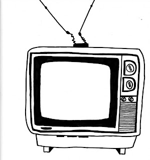
Initial TV illustration.
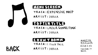
music credits menu.
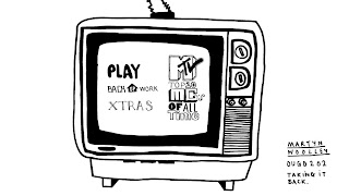
Main menu.
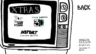
Extras menu.
Contact me menu.
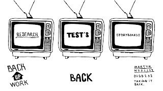
Back up work menu.
After I started to create my DVD in DVD studio pro i felt my initial ideas for the menu screens were a bit bland so I did some more, I added a illustration of a old TV to create that old skool vibe. This has made the Menu screens a little more interesting but I would like to maybe animate these menu's if need be.
Sunday, 7 February 2010
Friday, 5 February 2010
3d Glasses
Thursday, 4 February 2010
DVD packaging mock up
alterations to motion graphic
Tuesday, 2 February 2010
Final crit 5 key questions.
1. Does the motion graphic hold the viewer? If not how can this be improved?
2. Is the black and white text enough? I find it makes the video clear and legible but I feel like something could be added.
3. Is it clear that the research taken has influenced and help me develop my motion graphic so it is suitable for my audience?
4. Is the visual quality and technical competence of my work present? Any ways of improving?
5. Is there enough evidence of critical awareness throughout my project, if not how could I improve on this.
DVD menu screens
Feed back form.
Monday, 1 February 2010
Test 5 colour
So after talking to a few people at collage it was mentioned that i maybe needed to add colour to the motion graphic. Ive thought about ways of adding colour without breaking my original concept rule of keeping it simple and taking it back to the 80's hip hop flyer look. I started thinking about what i could do about adding colour, I ended up messing around with overlays of red and blue to create colour and also a 3d effect when worn with 3d glasses with our very popular at the moment.
Subscribe to:
Comments (Atom)


