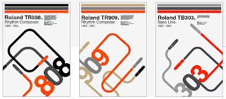
From the development of my initial ideas i used the idea of 'jack plugs' and the number of the roland instrument. I first started by add the illustrated jack plug and grouping it with number creating type as image, then i started to play around with composition to see which sits on the paper best.
After i had come up with a interesting composition i felt that the addition of colour would bring through the authenticity more. I investigated what colours the instrument were and from there creating a limited colour palette that could be used with the whole set of posters.
I then added specification information to the poster to create a Manuel/techy style look that would appeal to the target audience.


Nice!
ReplyDelete