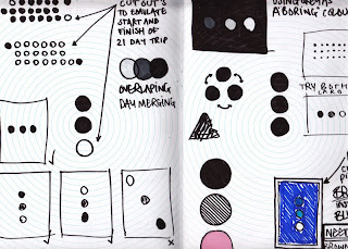
These are my outcomes for our first brief.
Full colour print-CMYK //A photograph i took in the summer i decided to add some bright colour and gradients to use the full potential of a full colour print. Printed on thick textured card to give a matt finish as the colours in the original photo were that off a old photograph. i feel the final outcome is good and have experimented with full colour print.
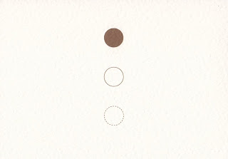
Pictogram-1 colour/monotone // This pictogram represents repetitive. The idea was that whilst i was away although things changed, city's, people, clothes (in some cases) i started to feel like i was on groundhog day, wake up and drive, play a show, get drunk. i chose brown as a colour as the van wasn't the cleanest place to live in and wanted to represent filth/dirty. The 3 dots also give the the feeling of a traffic light which also has a repeat pattern, starting, holding and stopping.
I think the concept and the design is a bit to misleading for a pictogram. I like the final outcome but feel i could of worked more on the concept and the design, for example making the middle circle a light shade of brown would of pushed the one colour barrier a bit more.
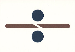
Logo-2 colour spot // The 2 colour logo i designed is for the band i went on tour with in the summer. The band are called Dividing the line. I wanted to keep it simple as logo's have to work on small scale's as well as large, in a array of colour's and on different stock's. I took this into account and used blue, which tie's in with my beach picture for the sea and a brown again to represent dirtiness/filth/unwashed/smelly. I also thought about what would happend when in greyscale (photo copied) and tryed to use a darker colour alongside a lighter colour. The design is playing on a division sign dividing the line that is part of the icon.
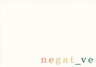
Word- 3 colour spot// The word i chose was 'negative' as i got caught in the trap of saying this instead of no/crap/bad. For example " would you like a drink?" reply "negative" or " I just fell on some broken glass!" In reply someone would say "that's pretty negative!". I played on the word and took away the 'i' and replaced with a underscore which looks like a minus sign. For colour i used red , yellow, and green to represent 'rasta' as the band did like to indulge in a few 'funny fags'.