

Wednesday, 16 December 2009


Distort# TEST11/12
I have applied the same principles to the word 'distort' now rather than just the letter d. I feel I am starting to understand after effects more and how it works, you can see this in the movements of the word, the movements are direct and structured. I also feel i am starting to show distortion in my animations more, using static and manipulation to distort the word.
Tuesday, 15 December 2009
Distort# TEST6/7/8/9
Here i have started to develop my ideas along side knowledge i have gained through our workshops with mike and through internet tutorials which i shall post to my design context blog. I have stuck with short, sharp, jerky movements as well as adding static or noise. I have decided to use Helvetica bold which gives a LOUD impression and have also gone with yellow for my colour, this gives of a feeling of warning like in caution signage etc. It also makes the black stand out and vise versa when reversed.
Wednesday, 9 December 2009
Story boards refined;continued


Planning is a important aspect when designing a motion graphic. Producing storyboards will help me plan out my animations and gives me chance to see how they will work before touching a computer.
Story boards refined


these are my storyboards i refined for the task's we got given.
1. d is for distortion
2. up and down movement
3. horizontal and vertical movement
4. all task's refine into 18 frames
Tuesday, 8 December 2009
Wednesday, 2 December 2009
Distort# TEST4
just made the end a little smoother , i have found time is so important to the design of your moving image, this video is 8 seconds long so i will have to think carefully about how much time i have and how many things i want to do.
Distort# TEST3
Started to use the position function a bit more along with the other transform tools. I also made good use of the blur effects which helps 'distort' my letter form and word. I also nested 3 compositions in to 1. This helped me create a number of different animations in a whole which made the outcome a bit more complex.
Tuesday, 1 December 2009
Initial idea

just a quick initial idea i did in flash. I think involving static could be a good idea to push the idea of distortion.
Tuesday, 24 November 2009
self evaluation
i feel my ability to investigate and develop ideas using material was good, but i felt i needed to look more into other stocks and be less narrow in my way of thinking. I only really looked into one or two stocks for my final packaging but, my research into printing i felt was substantial. I learnt things from books and primary research trips which is something i have never done before but will do in the future. I also learnt a lot of things from looking at printed material and investigating how its printed after learning about different printing methods. I felt the research i gathered i selected which bit's were relevant and developed this research into my work.
I felt i lacked actual evidence of trying to re-produce printing methods and finishes but for me crafting a final piece by hand is no relevant to the commercial printing process. I did however make good use of making prototypes using these in my editorial adverts and too see my packaging in context. I felt i investigated more in the development of my work and used this to inform my final design's.
I gained practical skills in things such as making mock ups, which made me think about how a 3d design would work rather than a flat 2d design. I also gained knowledge of indesign and felt this will make my work improve in areas of layout and type which is a area i am getting interested in more. I felt my idea generation was good and i was selective in choosing them and also made decision's and stuck with them. For me the design development was my strongest area. I used research to instruct my design work and i think you can tell this from the final product.
I felt i lacked on documentation of my project but did make relevant comment on my blog. Next time i will make more effort to document everything, this will hopefully make my design decisions easier to understand and more clear. My organization skills were good and i planned what i would be doing by using actions plans and list. I think you could see this in my work as it was not rushed or messy. This was the same in my presentation of my work, i am pleased wit the way the whole project looked and how it all tied in together.
I felt i answered the briefs well, my packaging product both packaged and promoted as well as being informative. My 16 page booklet, i felt also answered the briefs well i learnt a awful lot about commercial printing from doing this booklet and felt my layout skills improved dramatically.
5 things i will do differently next time.
- research more in to relevant stocks and techniques
- try and work to a deadline for production rather than the actual deadline.
-i won't use everything i gather in research, just select relative bits.
-try and push my ideas a bit more further to see what it would look like not just as a initial idea but also as a visual idea.
-document and evaluate my work as i go along.
Sunday, 22 November 2009
Thursday, 19 November 2009
Alterations
After doing some more research into printing i found out that flexography is the best way to print packaging. The print process was invented for this purpose , the design's for packaging are often blocky and type based so the quality of print does not need to be a high as litho or gravure.
Because my patient information sheet is printed on such a thin new print style stock, i have found out that it would be better to use gravure for the process rather than litho. If it was in mass production i imagine it would be web fed and cut after printing.
So now
Packaging - offset flexo Panatone 485c
Patient infomation sheet - Rotor gravure Panatone 485u
Glove - Stamp printing Panatone 485c
Blister pack foil - Thermoforming Panatone 485 c ink on top
I also looked into the costing of my 16 page booklet the average price for 500 full colour 16 page booklet's is £ 945 for numerous stocks 100 gsm silk and recycled papers, 115 gsm gloss and about £20 more for 150 gsm gloss and 170 gsm silk.
This would be with a standard same stock cover for a extra £568 i could of had the 250 gsm un coated + spot colour cover.
This is just a ruff pricing and not the exact price. i have emailed 3 printer's about a price for the exact specifications but have no yet received a quote back.
Tuesday, 17 November 2009
Photo's for promotion use


here's are some of the many photo's i took to involve in the promotion of my design.
publication adverts


These are some ideas for publication adverts promoting chilli through exciting packaging and warning message's. The adverts could sit in a range of magazines ranging from foody magazines to lads mags.
Wednesday, 11 November 2009
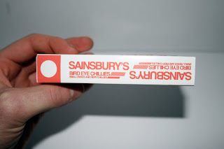
Sign up crit

After talking to lorenzo today in my sign up crit i have decided to drop the idea of re-designing the sainsbury's bird eye chilli packaging which will let me focus more on a target audience. The whole concept of my project was that when you eat chillies your brain release's endorphins and alters your mind set.
Because i dropped the re-design of the sainsbury's packaging i had to come up with
a new name, in the sign up it was made apparent that the packaging was very reminiscent of prescription medicine with was intended and there for the name should be to.
The name i have gone for is the chemical formula of capsicum the active ingredient in chilli which makes your brain release endorphins.
I have decided that my packaging could focus on a couple of target audience's.
- On the lash
- this idea would focus on the ' laddish ' society. Showing the packaging in a situation before a night out with the lads. Maybe with a bottle of alcohol or beer etc and each person 'dropping' a chilli to alter there mind set before going out.
- Kitchen danger
- this idea would involve the chillies being used in a kitchen. and playing on the idea that chilli can be a dangerous thing. I was thinking of a image of the packaging next to a chopping bored with a person chopping the chilli with the provided gloves on and a face mask and goggles, portraying the idea that chilli is a dangerous flavor that should be treated with caution.
These concept realization's could be used in editorial magazine adverts or on billboards, bus shelter's etc.
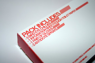
Print process of products.
CARTON- 1 spot colour offset litho/de-bossing for the braille warning and embossing for sell by date and info on side panel.
PATIENT INFO SHEET- 1 spot colour offset litho.
SURGICAL GLOVES- 1 spot colour
EDITORIAL ADVERTS- Full colour print litho.
Tuesday, 10 November 2009
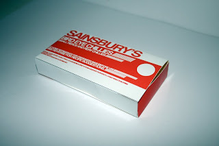
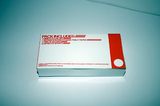
Mock up 2
Another mock up of my chilli packaging box. Through development of design sheets and thumbnails i have chosen to go for a prepscription medicine style look for the package. There are a few little things that will need to be done to the design but i hope this is something my final design will look like.


Evaulation 2 and group crit


Again same deal with the 1st evaluation a bit late but it up here now, i found this crit quite useful but felt i was quite a way into my project and felt focused on my task's and thing to do. I was useful though speaking to peers about which design's were working and which ones weren't. I have also got my action plan sorted and since the crit it has changed slightly , but is not to different from the one on here. One thing i did feel about the actual crit sheet was the language used, for me it was quite difficult to understand and i found it hard to asses others work against the criteria. after we got through a couple though it did become clearer.
Evaulation
 Bit late on the blog but this was the evaluation that was produced from our first crit. I had mine with Lorenzo. Out of the crit it was noted i had a clear concept and rational but need to fuel my ideas with some research into print production. I have looked more into print production but have not documented it. This is something i shall post to my design context blog this week.
Thursday, 5 November 2009
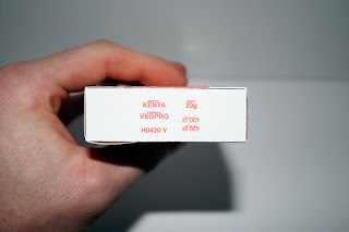
Mock up of box
Here is a few shot of a mock up of my packaging box, my final design will change through development but i think the size of the box will remain the same. It has enough room for 3-5 chillies, a info sheet and a pair of surgical gloves.
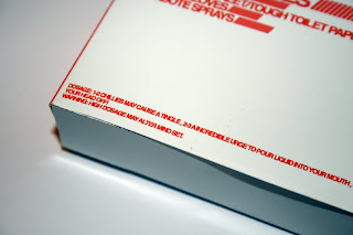
I printed it on the high gloss photo paper as this is the nearest thing i have to hand of the final stock i want to use. the gloss finish makes the red stand out and look vibrant and exciting much like the flavor of chilli.
I also forgot to put tabs on it but it was a good way to look at how my final product will look and feel.
Thursday, 29 October 2009
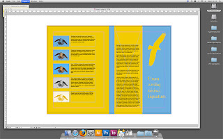
What is design for print booklet
Here's 2 DPS sample (not finished) page's from my 16 page 'what is print' booklet.


Wednesday, 21 October 2009
Flight checking for print
We had the task to check a document for errors before it went to print, in teams of 3 we started to work our way through the document finding errors which included wrong colour modes, RGB not CMYK, Wrong Image size, Use of colours not needed, Use of registration black instead of Key black, No bleed.
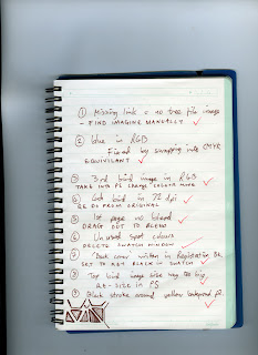
This was all done manually using our knowledge and the info tab,it can also be done by uses the preflight option in the file tab, but it is best to check for your self and give the printer a report in a text file.
Monday, 19 October 2009
Design idea development


Narrowed down my idea to, chili is a thrill, and to design packaging that promotes chili. The packaging needs to grab attention but also need to represent chili as a exciting flavor. I intend to look at packaging of chili's in supermarket's for my initial research.
Sunday, 18 October 2009

Sunday, 4 October 2009
summary of print presentation
- Choose a colour mode for your design, full colour or spot colour and weather it will be mono tone ,duo tone etc.
- Now this has been chosen you can choose which method you will print your work. eg offset lithograph, flexograph, silk screen or thermograph.
- now you can choose the stock you would like to print on as some printing methods are better for some stocks than others. eg if you were printing onto sand paper you would have to silk screen as running sand paper through a lithograph may cause damage to the machine. If you were printing a detailed full colour print on to newsprint a lithogrpah machine would be better than flexograph machine as more detail is kept in the aluminum paltes compared to the rubber plates.
- Each design needs to be considered differently when sent to print. And you can also keep control over your work if you know how the final outcome will be printed.
Monday, 28 September 2009
Brief 001- final outcome

These are my outcomes for our first brief.
Full colour print-CMYK //A photograph i took in the summer i decided to add some bright colour and gradients to use the full potential of a full colour print. Printed on thick textured card to give a matt finish as the colours in the original photo were that off a old photograph. i feel the final outcome is good and have experimented with full colour print.
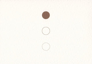
Pictogram-1 colour/monotone // This pictogram represents repetitive. The idea was that whilst i was away although things changed, city's, people, clothes (in some cases) i started to feel like i was on groundhog day, wake up and drive, play a show, get drunk. i chose brown as a colour as the van wasn't the cleanest place to live in and wanted to represent filth/dirty. The 3 dots also give the the feeling of a traffic light which also has a repeat pattern, starting, holding and stopping.
I think the concept and the design is a bit to misleading for a pictogram. I like the final outcome but feel i could of worked more on the concept and the design, for example making the middle circle a light shade of brown would of pushed the one colour barrier a bit more.
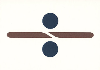
Logo-2 colour spot // The 2 colour logo i designed is for the band i went on tour with in the summer. The band are called Dividing the line. I wanted to keep it simple as logo's have to work on small scale's as well as large, in a array of colour's and on different stock's. I took this into account and used blue, which tie's in with my beach picture for the sea and a brown again to represent dirtiness/filth/unwashed/smelly. I also thought about what would happend when in greyscale (photo copied) and tryed to use a darker colour alongside a lighter colour. The design is playing on a division sign dividing the line that is part of the icon.
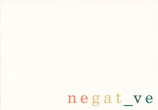
Word- 3 colour spot// The word i chose was 'negative' as i got caught in the trap of saying this instead of no/crap/bad. For example " would you like a drink?" reply "negative" or " I just fell on some broken glass!" In reply someone would say "that's pretty negative!". I played on the word and took away the 'i' and replaced with a underscore which looks like a minus sign. For colour i used red , yellow, and green to represent 'rasta' as the band did like to indulge in a few 'funny fags'.
Sketch book


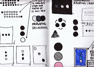
Just a few snippets of my initial ideas and design's from my sketch book for the 1 colour pictogram, the 2 colour logo and the 3 colour word.
Subscribe to:
Comments (Atom)