Wednesday, 16 December 2009
Distort# TEST11/12
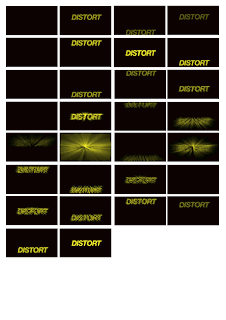
I have applied the same principles to the word 'distort' now rather than just the letter d. I feel I am starting to understand after effects more and how it works, you can see this in the movements of the word, the movements are direct and structured. I also feel i am starting to show distortion in my animations more, using static and manipulation to distort the word.
Tuesday, 15 December 2009
Distort# TEST6/7/8/9
Here i have started to develop my ideas along side knowledge i have gained through our workshops with mike and through internet tutorials which i shall post to my design context blog. I have stuck with short, sharp, jerky movements as well as adding static or noise. I have decided to use Helvetica bold which gives a LOUD impression and have also gone with yellow for my colour, this gives of a feeling of warning like in caution signage etc. It also makes the black stand out and vise versa when reversed.
Wednesday, 9 December 2009
Story boards refined;continued
Story boards refined
Tuesday, 8 December 2009
Wednesday, 2 December 2009
Distort# TEST4
just made the end a little smoother , i have found time is so important to the design of your moving image, this video is 8 seconds long so i will have to think carefully about how much time i have and how many things i want to do.
Distort# TEST3
Started to use the position function a bit more along with the other transform tools. I also made good use of the blur effects which helps 'distort' my letter form and word. I also nested 3 compositions in to 1. This helped me create a number of different animations in a whole which made the outcome a bit more complex.
Tuesday, 1 December 2009
Initial idea
Subscribe to:
Posts (Atom)


