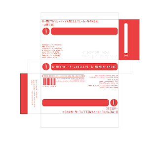
After talking to lorenzo today in my sign up crit i have decided to drop the idea of re-designing the sainsbury's bird eye chilli packaging which will let me focus more on a target audience. The whole concept of my project was that when you eat chillies your brain release's endorphins and alters your mind set.
Because i dropped the re-design of the sainsbury's packaging i had to come up with
a new name, in the sign up it was made apparent that the packaging was very reminiscent of prescription medicine with was intended and there for the name should be to.
The name i have gone for is the chemical formula of capsicum the active ingredient in chilli which makes your brain release endorphins.
I have decided that my packaging could focus on a couple of target audience's.
- On the lash
- this idea would focus on the ' laddish ' society. Showing the packaging in a situation before a night out with the lads. Maybe with a bottle of alcohol or beer etc and each person 'dropping' a chilli to alter there mind set before going out.
- Kitchen danger
- this idea would involve the chillies being used in a kitchen. and playing on the idea that chilli can be a dangerous thing. I was thinking of a image of the packaging next to a chopping bored with a person chopping the chilli with the provided gloves on and a face mask and goggles, portraying the idea that chilli is a dangerous flavor that should be treated with caution.
These concept realization's could be used in editorial magazine adverts or on billboards, bus shelter's etc.
Print process of products.
CARTON- 1 spot colour offset litho/de-bossing for the braille warning and embossing for sell by date and info on side panel.
PATIENT INFO SHEET- 1 spot colour offset litho.
SURGICAL GLOVES- 1 spot colour
EDITORIAL ADVERTS- Full colour print litho.

No comments:
Post a Comment